


Not so long ago, a new stable version of the Flutter SDK was released - v3.13.0. This introduces some new features. While the official announcement covers all the details, I thought it will be great to dive into some highlights
Now, let's get started.
Even though Flutter is great for making apps that work on different devices, sometimes making them look just right on each platform takes a bit more work. You might have noticed this when making apps for Android and iOS. Android has its style with Material components, while iOS has that Cupertino look. While Flutter lets us change how things look, sometimes we want them to feel just like the platform. Think about the AlertDialog for Android and the CupertinoAlertDialog for iOS – each one fits its platform perfectly. Now, imagine you're making an app for both Android and iOS. To make it shine, you'd want to use widgets that match each platform's style.
Here is a bit of code I wrote not so long ago, implementing an alert dialog:
Future<bool> _showAlertDialog() async {
    if (!Platform.isIOS) {
      return _showIosAlertDialog();
    } else {
      return _showAndroidAlertDialog();
    }
  }

Future<bool> _showAndroidAlertDialog() async {
    final shouldPop = await showDialog<bool>(
      context: context,
      builder: (context) {
        return AlertDialog(
          title: _alertDialogTitle,
          content: _alertDialogContent,
          actions: _alertDialogActions,
        );
      },
    );
    return shouldPop ?? false;
  }

  Future<bool> _showIosAlertDialog() async {
    final shouldPop = await showCupertinoDialog<bool>(
      context: context,
      builder: (context) {
        return CupertinoAlertDialog(
          title: _alertDialogTitle,
          content: _alertDialogContent,
          actions: _alertDialogActions,
        );
      },
    );
    return shouldPop ?? false;
  }
Probably feels like a lot. In Flutter 3.13.0, a neat feature comes to the scene – Platform adaptive dialog. By simply using the AlertDialog.adaptive() constructor, the heavy lifting is for you. This means that on iOS, it'll automatically display the CupertinoAlertDialog, while on Android, you'll get the Material AlertDialog
Here is what that looks like:
 Future<bool> _showAlertDialog() async {
    final shouldPop = await showDialog<bool>(
      context: context,
      builder: (context) {
        return AlertDialog.adaptive(
          title: _alertDialogTitle,
          content: _alertDialogContent,
          actions: _alertDialogActions,
        );
      },
    );
    return shouldPop ?? false;
  }
If you've never used Slivers, you should. They help you build a performant custom scrolling experience. Here is a video of a brief introduction to Slivers by Kate Lovett from the Flutter team.
If you're already acquainted with Slivers, that's fantastic. The latest version, Flutter 3.13.0, comes bearing some fresh Slivers, among which we have DecoratedSliver – think of it as a cousin to DecoratedBox. This lets you add a personal touch to a Sliver, which is a portion of a scrollable area, by applying a custom style.
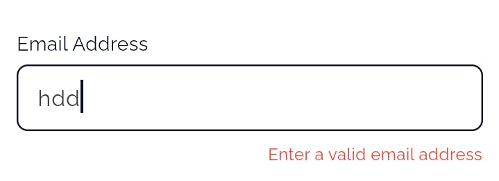
Flutter has taken the customization of material widgets a step further. In the past, when working with InputDecoration, you might have felt a bit limited in directly managing the appearance of error messages, their positioning, and overall visual style.

In the image provided above, you can see the default Material style for error text. However, we now can make a few adjustments. For instance, we can change its position using the error property within InputDecoration. To give you a better idea, here's what it would look like if we decided to alter its position:
Here is the code:
decoration: InputDecoration(
//1
  error: _validateEmail(_controller.text),
),

//2
Widget? _validateEmail(String? value) {

//3
  String? errorText;
  late final textWidget = Align(
    alignment: Alignment.centerRight,
    child: Text(
      errorText!,
      style: const TextStyle(color: Colors.red, fontSize: 12),
    ),
  );

//4
  if (value == null || value.isEmpty) {
    errorText = 'Email is required';
    return textWidget;
  }

  if (!isEmailValid) {
    errorText = 'Invalid email address';
    return textWidget;
  }

//5
  return null;
}
There are a few things to note, but let's go through the code first.
The
errorproperty is what allows you to control the manipulate the error text to your desire. The interesting thing here is theerrorproperty takes a widget; this is what allows us to change the position. Unfortunately, it does not work thevalidationproperty in InputDecoration, and so you have to provide your validation logic outside of the InputDecoration if you want to control when the error is displayed; I'll talk more about this.The custom validator returns a widget when the validation conditions are not met and returns null when they are not. When null is returned, the `error` displays nothing.
The string that will be displayed and the Text widget are first defined. This allows us to avoid repeating the Text widget in a case where we have a lot of validation conditions - like in a password field.
In this example, two conditions are evaluated to decide whether an error is triggered, each with its unique message. The 'isEmailValid' could be any pre-existing logic that verifies whether the entered email is valid – RegEX is a handy tool here.
And finally, if none of the conditions are met, null is returned which signifies that the input field is valid and the error message should remain hidden.
Now, if your validation logic is neatly tucked away from your UI code, the concept remains consistent, though the execution might vary. Let's consider an instance – suppose you're using a package like formz that smartly separates your validation code from the UI. In this scenario, you could explore a path like this:
error: (emailInput.displayError?.errorText != null)
          ? Align(
              alignment: Alignment.centerRight,
              child: Text(
                emailInput.displayError!.errorText,
                style: TextStyle(color: Colors.red, fontSize: 12),
              ),
            )
          : null,
I'm sure you've picked up on a couple of issues with our current implementation. If you compare the two images, you'll notice that the first one has a red border and a red cursor when the error message appears, while the second one – our custom error – lacks this behaviour. This circles back to what I mentioned earlier about the validation property within InputDecoration not being usable with the error property; validation returns a String?, whereas the error property expects a Widget?. Let's delve into this topic a bit more.
During the discussion of this feature implementation, the idea of how validation would work was brought up in this comment. One approach was introducing a validatorBuilder. The original PR that worked on introducing this feature implementation was unfortunately abandoned. The new PR that eventually got merged from a different contributor was missing the validatorBuilder which was discussed in the previous PR, not sure why.
Hopefully, in future patch releases of Flutter, this could be addressed.
So back to the challenge of showing a red border and a red cursor during validation. We can solve this by simply adding a few conditionals.
decoration: InputDecoration(
// You can use whatever conditions that signifies that the input field is valid
  focusedBorder: (!isEmailVaid)
      ? OutlineInputBorder(
          borderRadius: BorderRadius.circular(987),
          borderSide: const BorderSide(color: Colors.red),
        )
       : someDefaultBoder,
)
You must also provide the same logic for the enabledBorder property, or when the input field loses focus the red border will also be removed. Using this conditional also applies to the cursor colour.

Another interesting thing is you could also change the colour of the error message:
Widget? _validateEmail(String? value) {
    const style = TextStyle(color: Colors.red, fontSize: 12);
    String? errorText;
    late final textWidget = Align(
      alignment: Alignment.centerRight,
      child: Text.rich(
        TextSpan(
          text: errorText,
          children: [
            TextSpan(
              text: 'email address',
              style: style.merge(const TextStyle(color: Colors.green)),
            ),
          ],
        ),
        style: style,
      ),
    );

    if (!isEmailValid) {
      errorText = 'Enter a valid ';
      return textWidget;
    }

    return null;
  }

What I've highlighted here is not exhaustive and is just a glimpse of what's new. Flutter has introduced a range of other exciting features as well. For a comprehensive overview, I recommend checking out the full announcement.